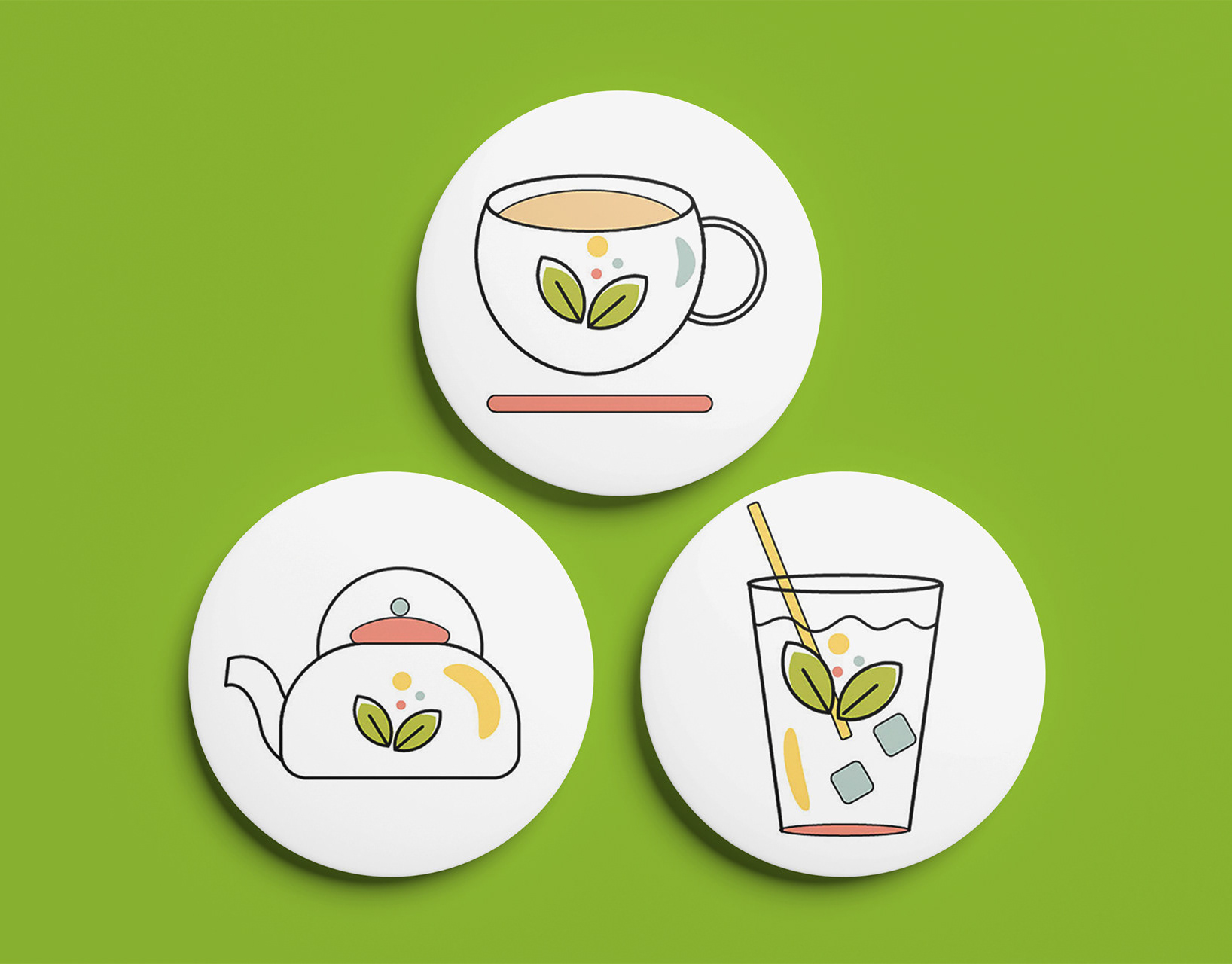
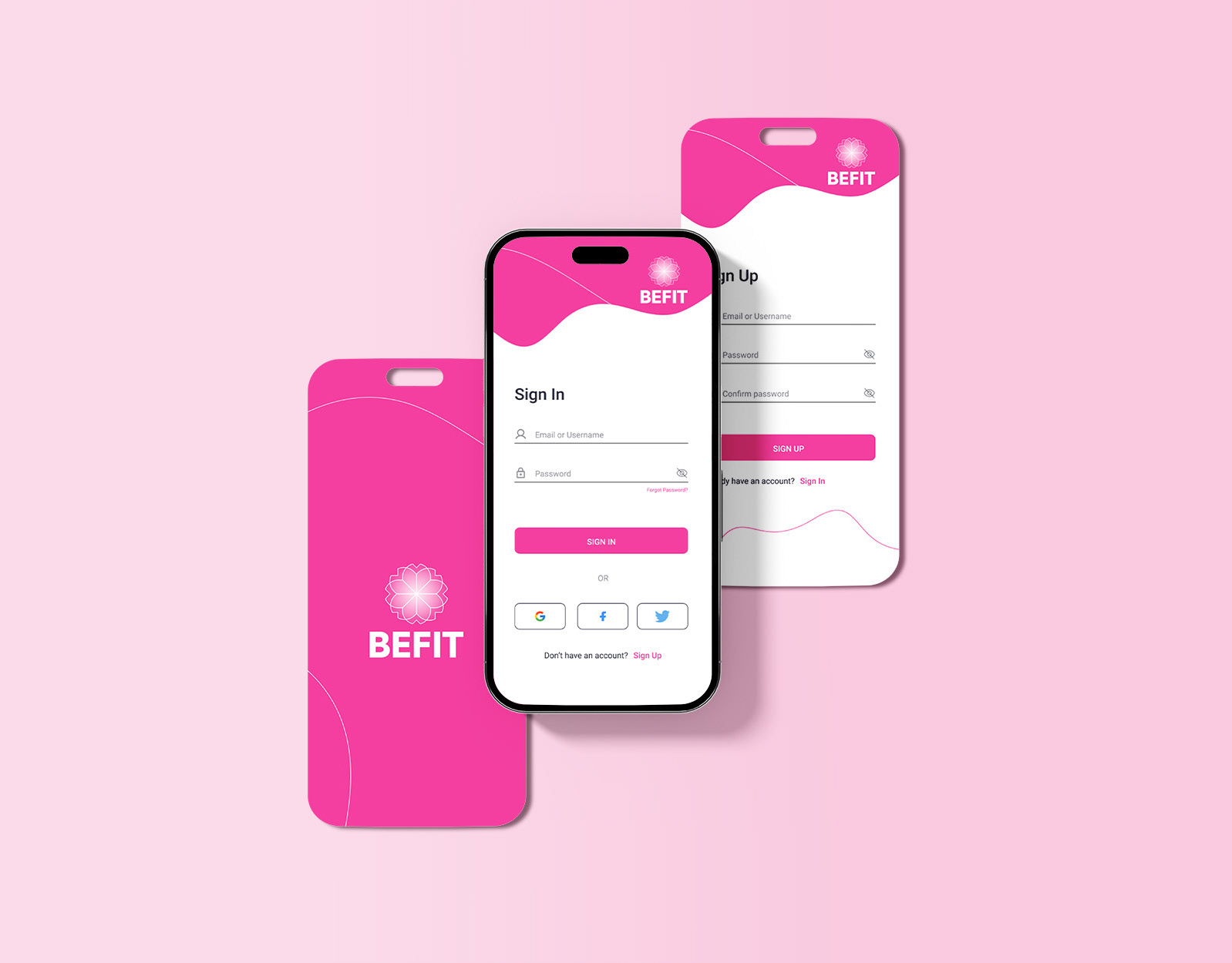
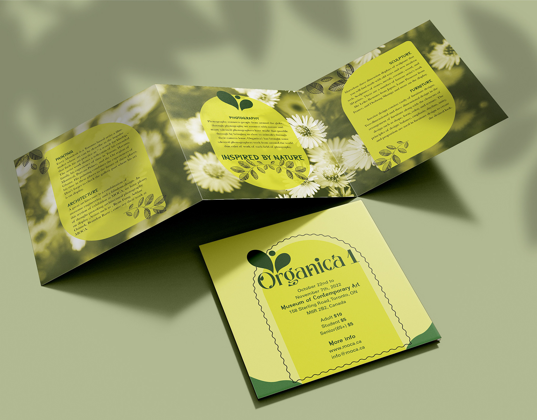
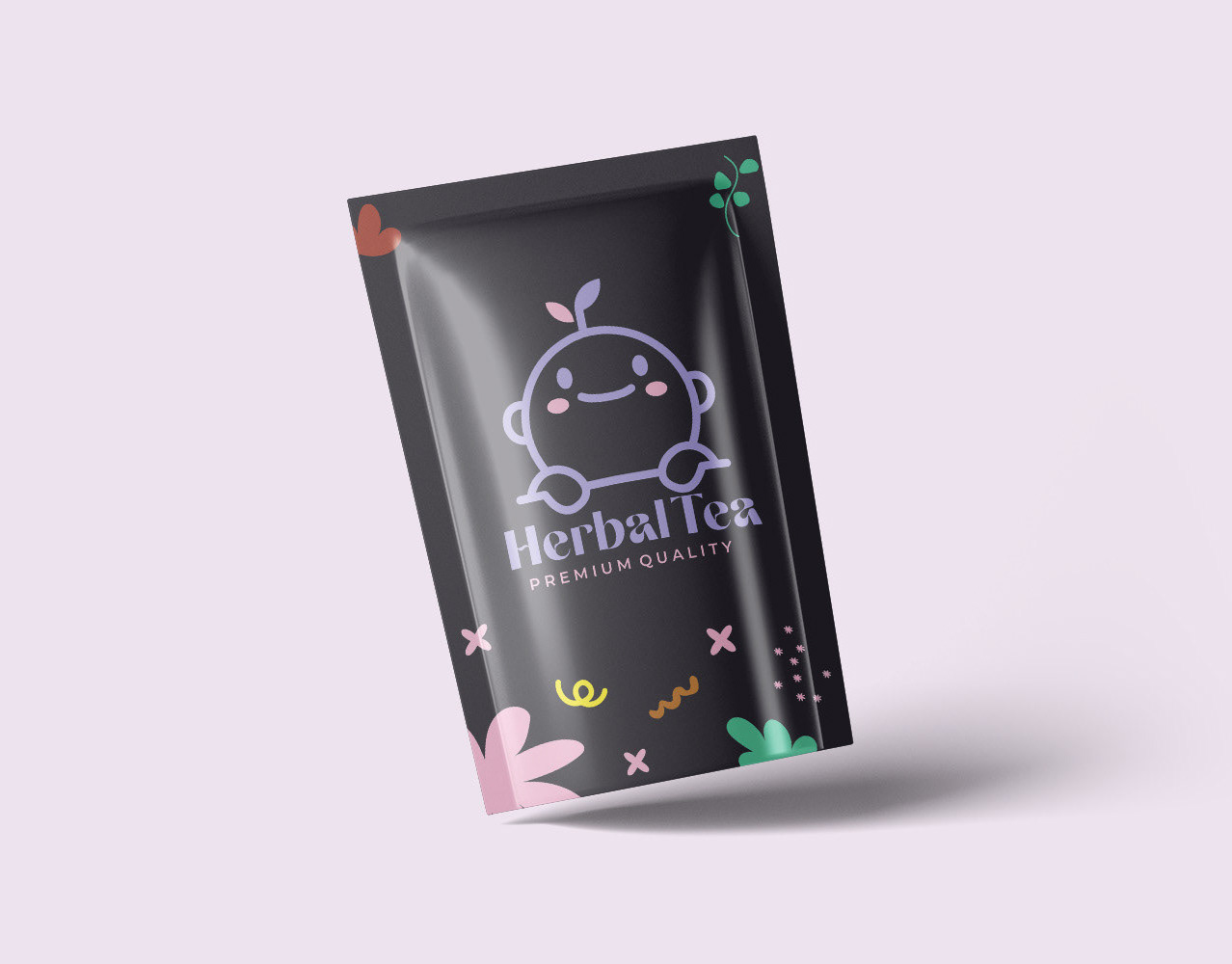
The goal of this project was to create a cohesive branding identity for a Fashion brand. The goal was to create a modern fashion brand that aimed to reflect the brand's commitment to style and environmental responsibility through a sleek logo, vibrant colour palette, and versatile typography.
- My Role: Graphic Designer | Logo Design
- Tools: Illustrator, Photoshop, Indesign
- Scope: Logo Design
- Date: 2022
Challenge
The key challenge was to capture the dual essence of Fashion Bee: its fashionable, high-end appeal and its dedication to sustainability. The branding needed to convey sophistication while incorporating elements that reflect the brand's eco-friendly ethos. Additionally, ensuring the brand’s visual identity was versatile enough to work across packaging, digital platforms, and promotional materials required a thoughtful and strategic design approach.
The key challenge was to capture the dual essence of Fashion Bee: its fashionable, high-end appeal and its dedication to sustainability. The branding needed to convey sophistication while incorporating elements that reflect the brand's eco-friendly ethos. Additionally, ensuring the brand’s visual identity was versatile enough to work across packaging, digital platforms, and promotional materials required a thoughtful and strategic design approach.
Thank YOu!
--------------------------------------------------------------------------------


